


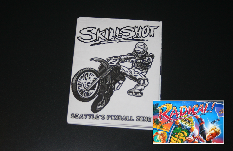
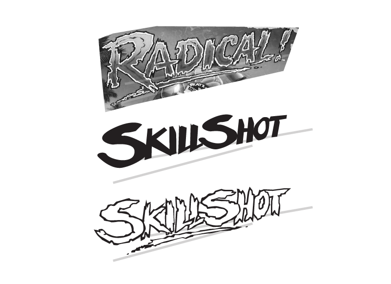
Cover art from William's Banzai Run (1988. Logotype is based on the Midway's Radical! (1990).
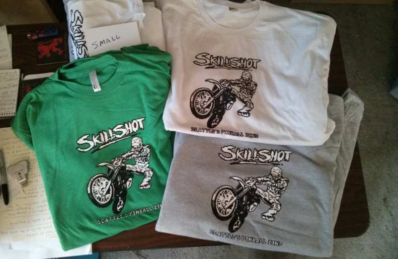
This cover was so popular we had t-shirts made using two spot colors, white and black.


Cover art from Gottlieb's Genie (1979). Logotype is based on Data East's Time Machine (1988). The letterforms aren't from Time Machine's main logotype, instead, from a smaller font used throughout the play field.
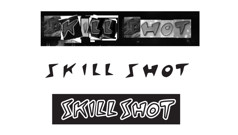

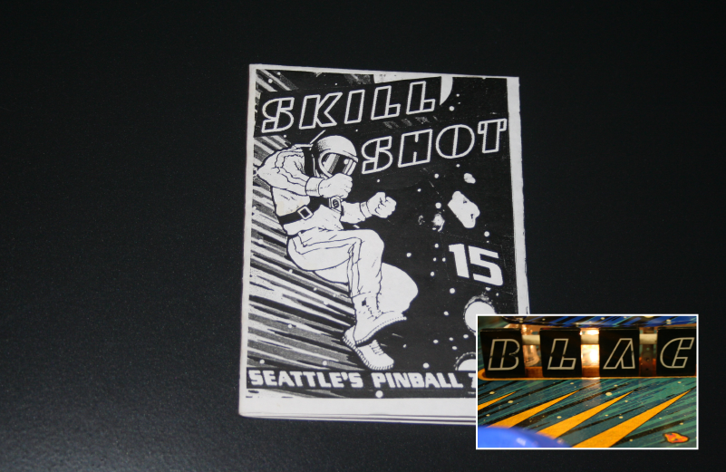
The Sega version of Star Wars, Star Wars Trilogy (1997) spells out SKILL SHOT on the dot matrix display, seemed like a good place to start. Wasn't strong enough so we went back to the more well known version from the film and merged it with the movement of the dot matrix.


Cover art from Bally's Party Animal (1991). Logotype mimics what's seen on the comic book, "The Walking Dead". Cover was selected to create 7-color, spot color t-shirts.
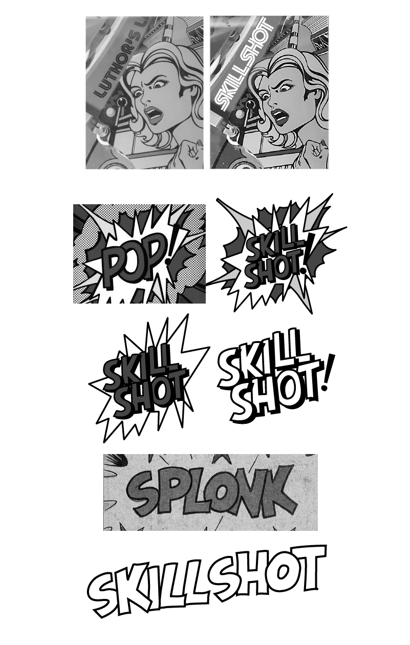
Cover art from Atari's Superman (1979). One direction would be to mimic the typeface from the pinball game for Lex Luthor's Lair, instead, decided Roy Lichtenstein and his pop art style would be better inspiration.

Cover art from Midway's NBA Fastbreak (1997). The logotype ended up more inspired by a candy bar than basketball

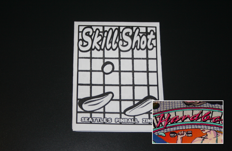
Cover art from Bally's Hard Body Dirty (1987). Probably the biggest visual departure from the source while still being influenced from the original.
